Plotting Data
Plotting Data
Describing Distribution
Example Continued
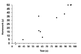
Step 2. Plot each point in the table as an (x, y) coordinate point.
The data is graphed below:

Step 3. Is there a relationship between the two variables?
The points are basically all doing the same thing, so there is a relationship.
Step 4. Is the graph linear or non-linear?
It is basically linear with a couple of points that do not follow the pattern.
Step 5. Is the relationship positive or negative? Is it strong or weak?
As the x-values increase, so do the y-values. Therefore, the graph is positive. Most of the points are in the same line, so it is relatively strong.